
Perla — between softness and trust.
PERLA is a feminine care brand developed for Al-Dawaa Pharmacies, created to occupy the space between clinical reliability and modern self-care aesthetics.
At the center of the brand stands the idea: “Barely There. Fully Care.”A positioning that reflects products designed to feel light and unobtrusive in everyday life, while still delivering complete care and performance when needed.
- Client
- Al-Dawaa Pharmacies
- Brand
- Perla
- Sector
- Feminine Care · Personal Care
- Markets
- Saudi Arabia
- Scope
- Visual Identity · Packaging Design · Future Portfolio Direction
- Formats
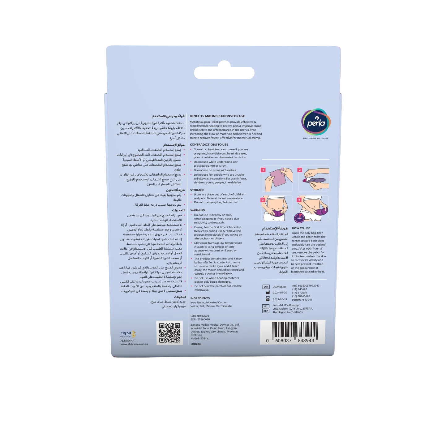
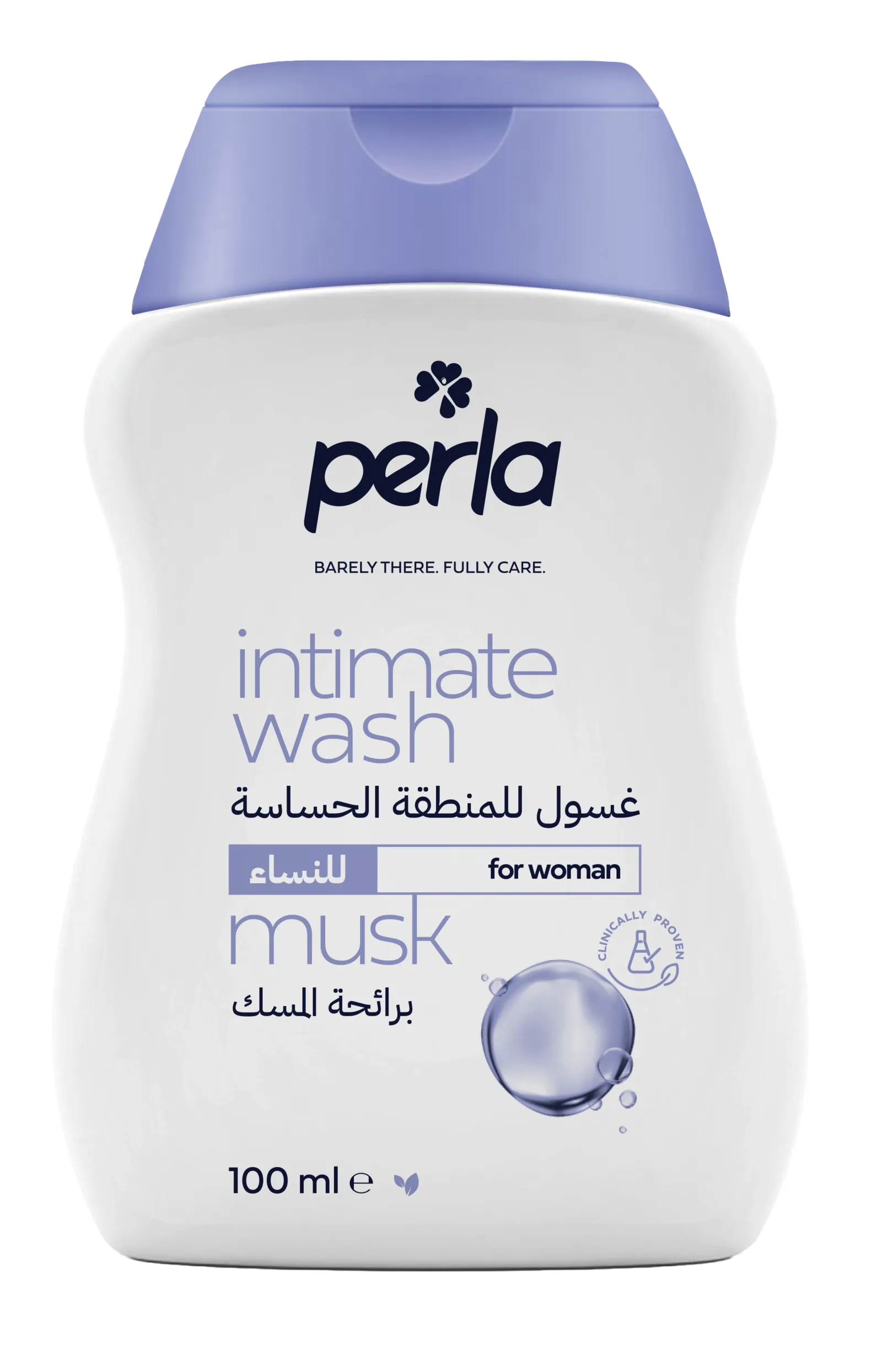
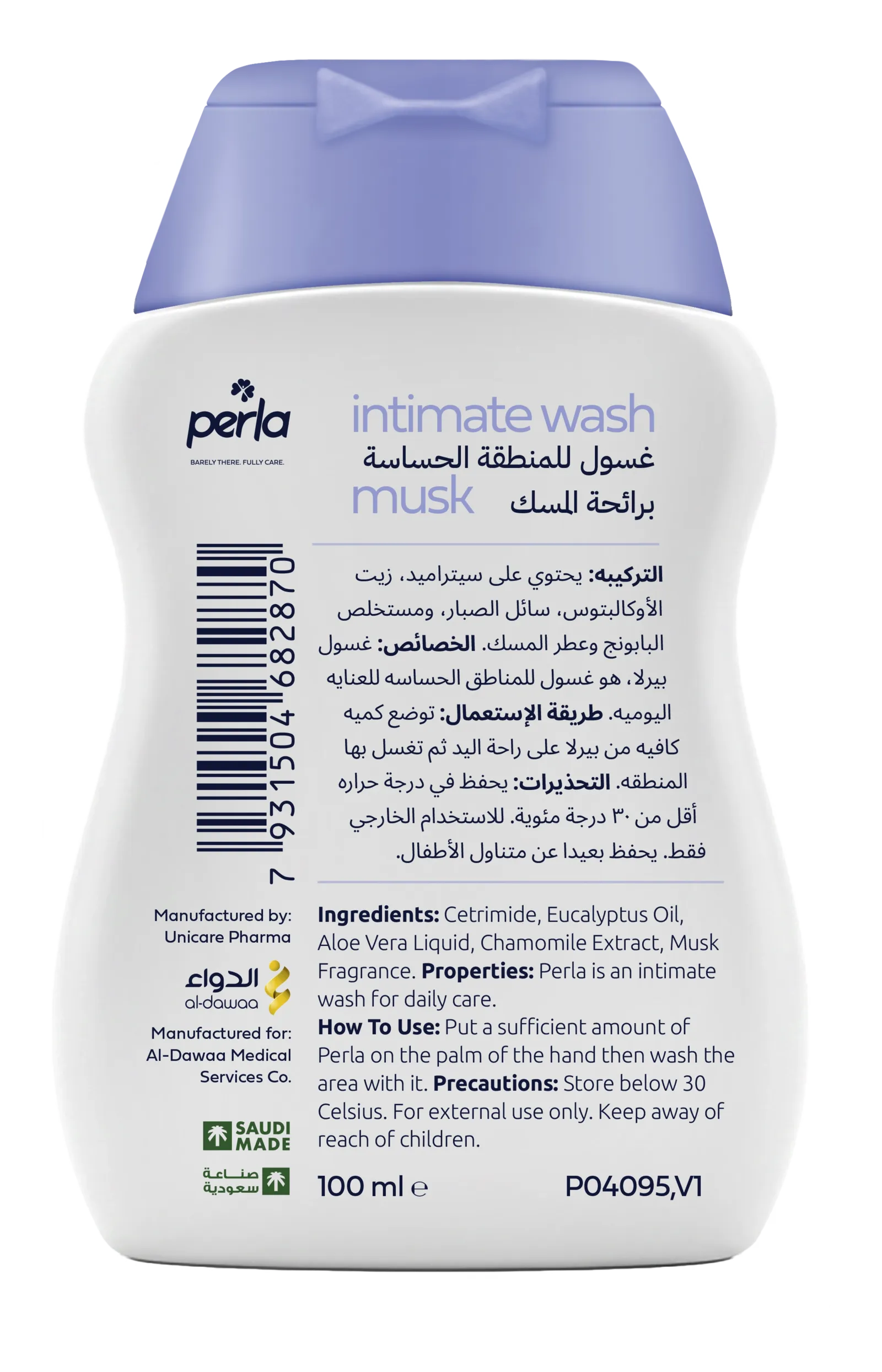
- visual identity guide · packages for pain relief patches and intimate wash
Finding the right balance
Leaning too heavily into medical language risked making the brand feel cold and impersonal, while moving too far into beauty territory could weaken trust and product credibility.
Another important aspect was scalability. Perla was never intended to exist as a single-product brand. The identity system needed to work across different categories — from Pain Relief Patches and Intimate Wash to future products — without losing consistency or recognition.
A Flexible Visual System
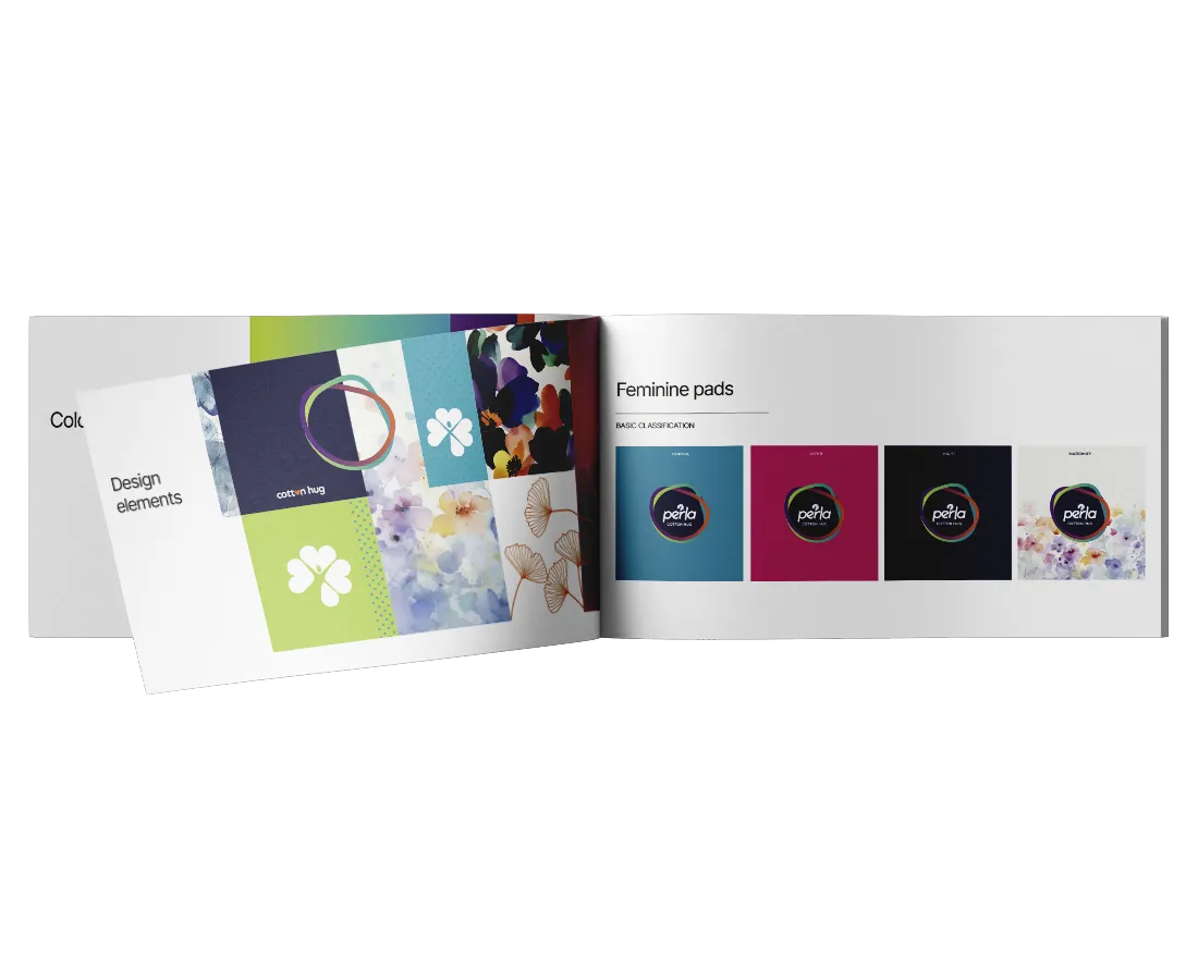
A refined visual language was developed to balance consistency with flexibility, allowing each product category to express its unique character while maintaining a cohesive brand identity.
Clear Visual Language
A restrained and elegant design approach built around clarity, simplicity, and visual balance.
Adaptive Design System
Typography, color palettes, and information hierarchy were designed to evolve across product categories while preserving a unified brand identity.
Category-Specific Expression
Each packaging type was tailored to its purpose—from the functional communication of Pain Relief Patches to the softer aesthetic of Intimate Wash.
Consistent Brand Identity
Despite differences in tone and visual treatment, every product remains connected through the same design principles and cohesive visual logic.
The result is a scalable feminine care brand system.
Typography, color palettes, and information hierarchy were carefully designed to shift depending on the product category while preserving a unified brand feeling.
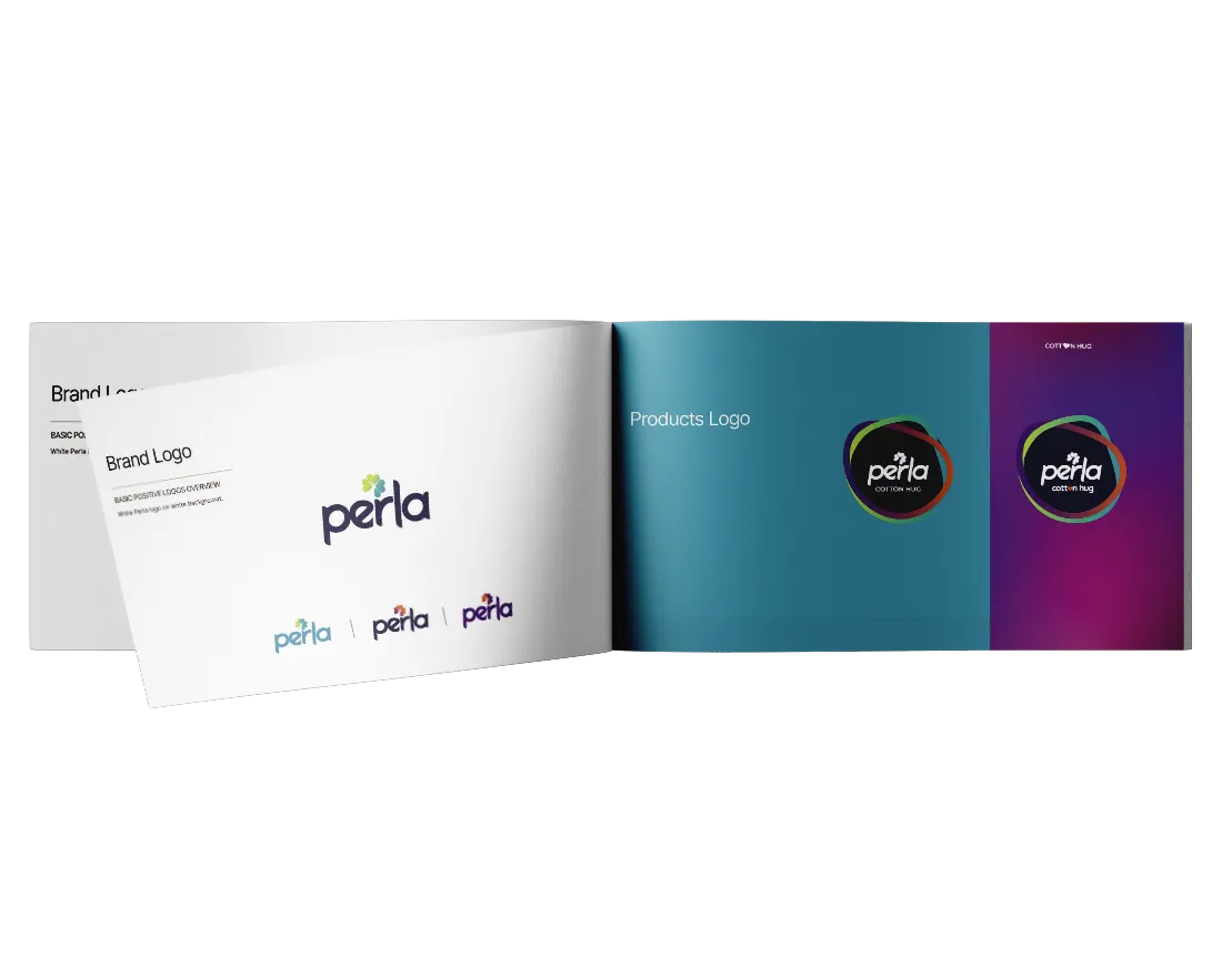
Logo and design system
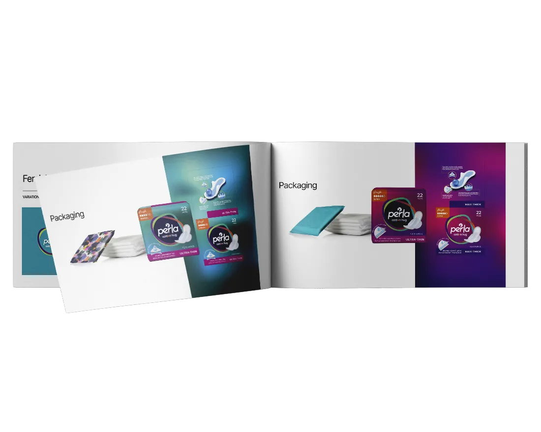
Packaging
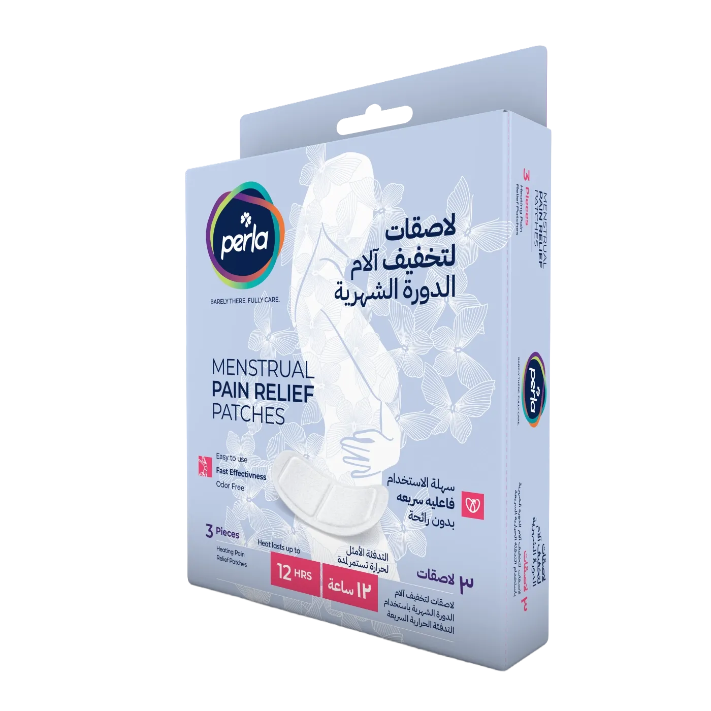
Perla successfully establishes a recognizable identity that can evolve across future product extensions.