
Toddies Routine — a softer expression of familiar brand
Toddies is a baby care brand developed within Al-Dawaa’s private label portfolio, created to provide accessible quality across essential parenting categories — from diapers and wipes to everyday care products.
As the brand expanded into bath and skincare, a new design approach was needed to reflect the different role these products play in consumers’ routines.
- Client
- Al-Dawaa Pharmacies
- Brand
- Toddies Routine
- Sector
- FMCG · Baby Care · Bath & Skincare
- Markets
- Saudi Arabia
- Scope
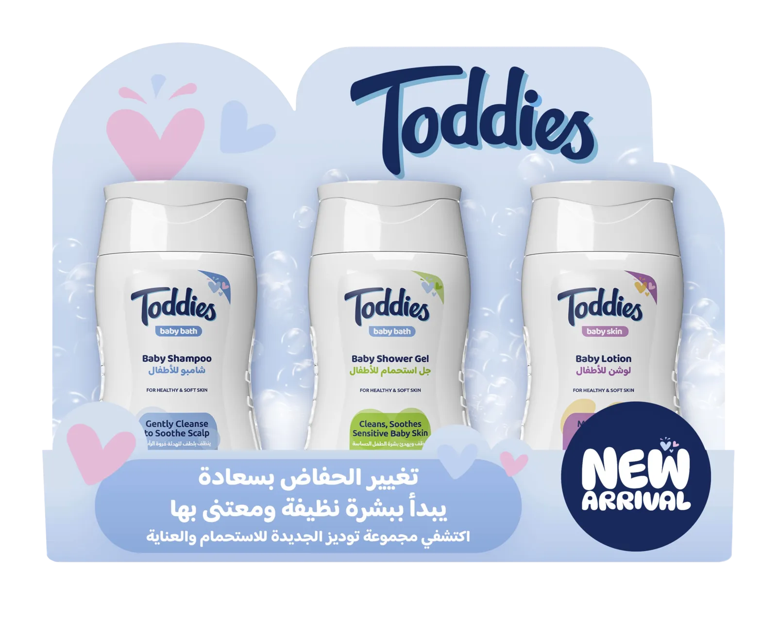
- Packaging design · POSM design · digital communication assets
- Formats
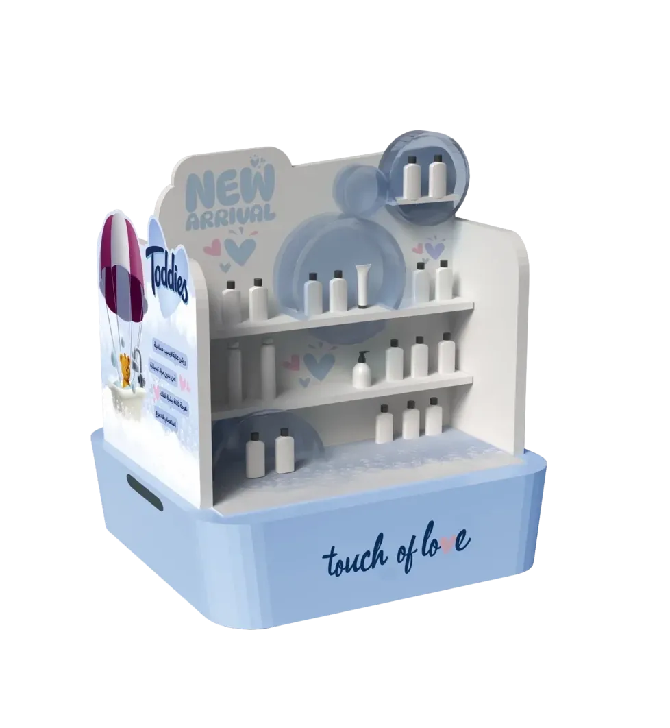
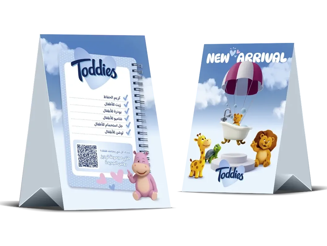
- Product packaging · gondolas · parasitic displays · wobblers · dividers · shelf talkers · tent cards · emailers · social media posts
Introducing a softer and calmer emotional tone suited to the category
Unlike diapers or wipes, bath and skincare products are not purely functional.
They belong to quieter, more intimate moments of everyday care. The challenge was to create a visual identity that could maintain consistency with the established Toddies brand while introducing a softer and calmer emotional tone suited to this category. The new range needed to feel recognizably Toddies, but with a more delicate and atmospheric expression that could support both product differentiation and emotional connection.
The solution focused on evolving the existing identity rather than replacing it
The visual identity was refined to create a calmer, warmer, and more cohesive brand experience across packaging and all communication touchpoints.
Refined Visual Language
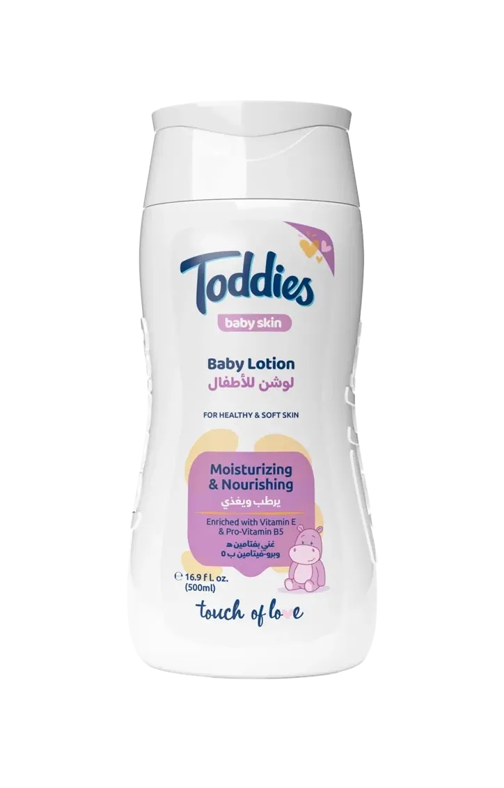
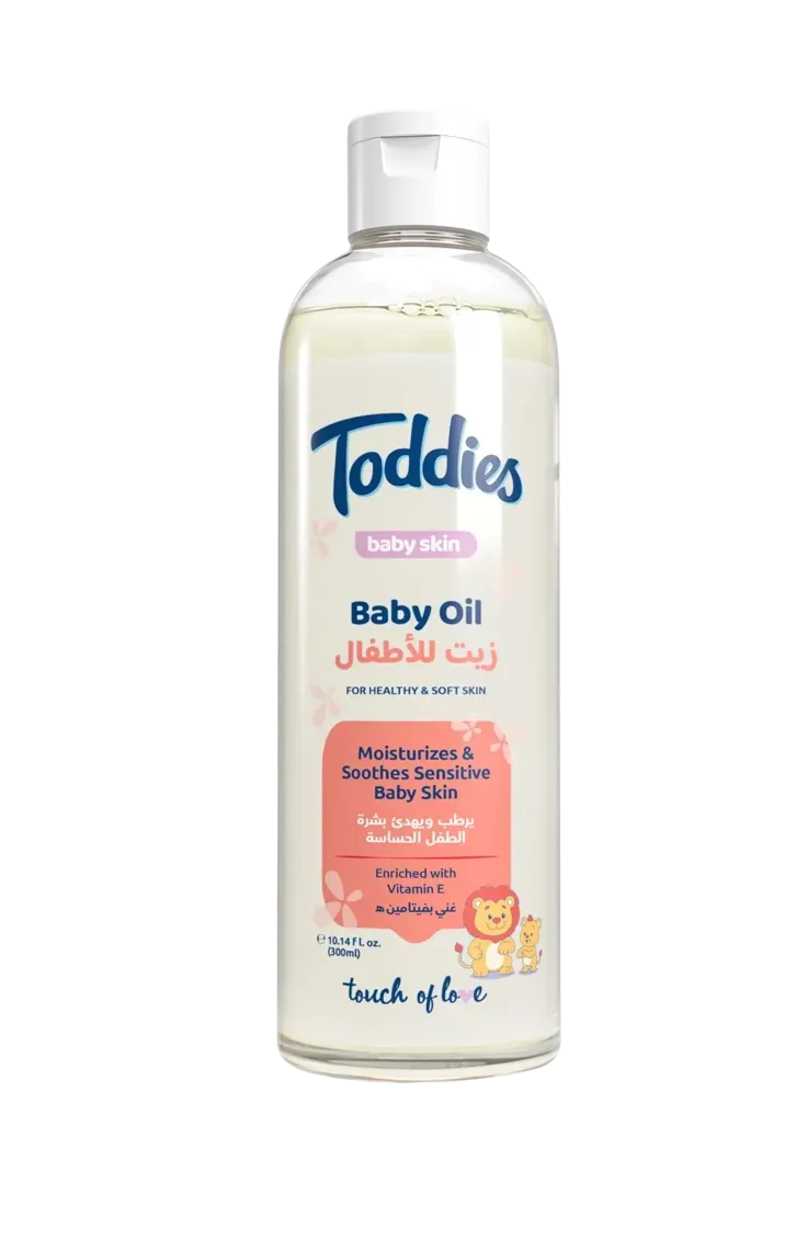
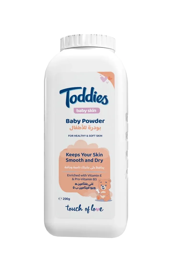
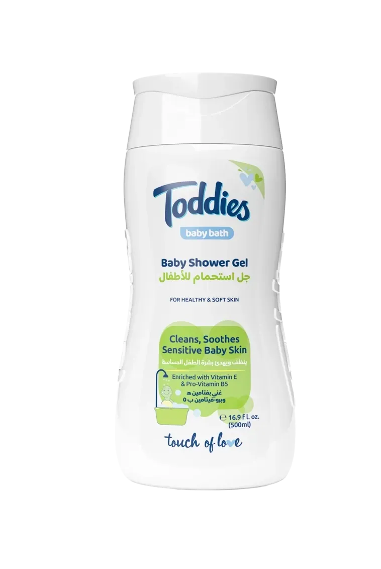
The visual system was softened through a lighter color palette, gentler shapes, and a more reduced graphic approach, resulting in a calm and unobtrusive product presence.
Signature Character Redesign
The brand’s iconic animal characters were carefully redesigned to preserve familiarity while becoming quieter and more seamlessly integrated into the overall composition.
Experience-Driven Design
Rather than competing for shelf dominance, the design focused on creating an atmosphere of comfort, softness, and the emotional rhythm associated with bath and skincare rituals.
Integrated Brand System
The project extended beyond packaging to include a complete retail and communication system — gondolas, parasitic displays, wobblers, dividers, shelf talkers, tent cards, emailers, and social media assets—ensuring consistency across every physical and digital touchpoint.
Consistency across physical and digital touchpoints.
The project extended beyond packaging into a complete retail and communication system, including gondolas, parasitic displays, wobblers, dividers, shelf talkers, tent cards, emailers, and social media assets — all developed to ensure consistency across physical and digital touchpoints.
Packages
POSM

Digital
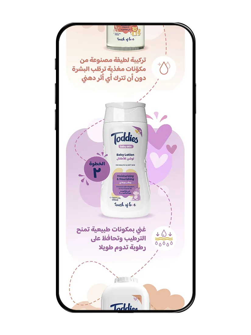
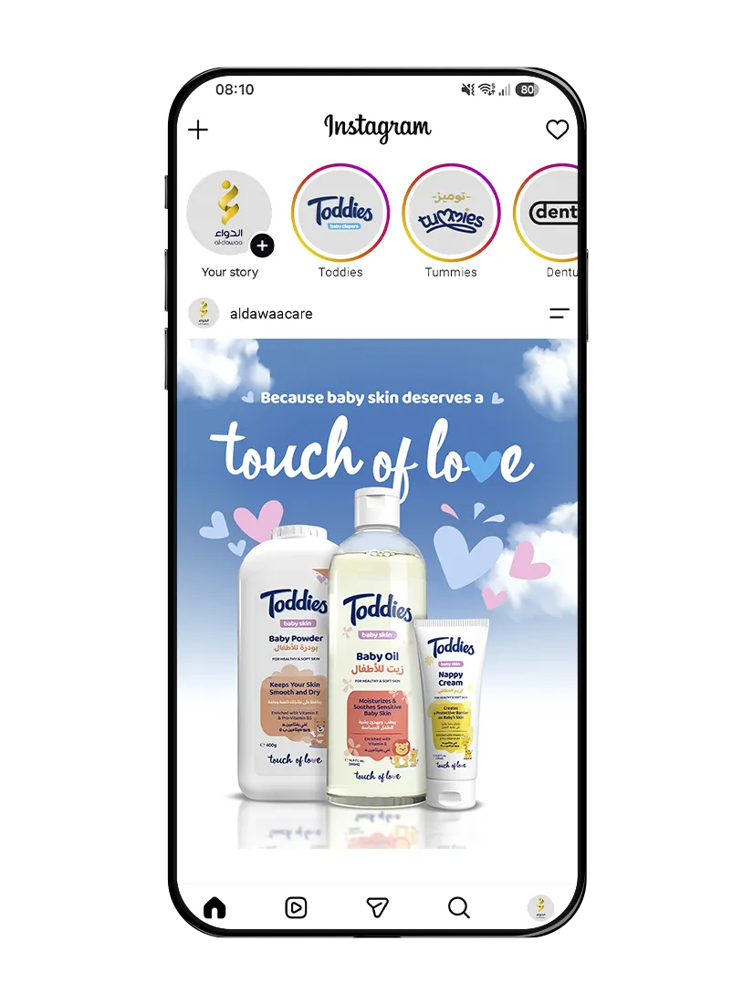
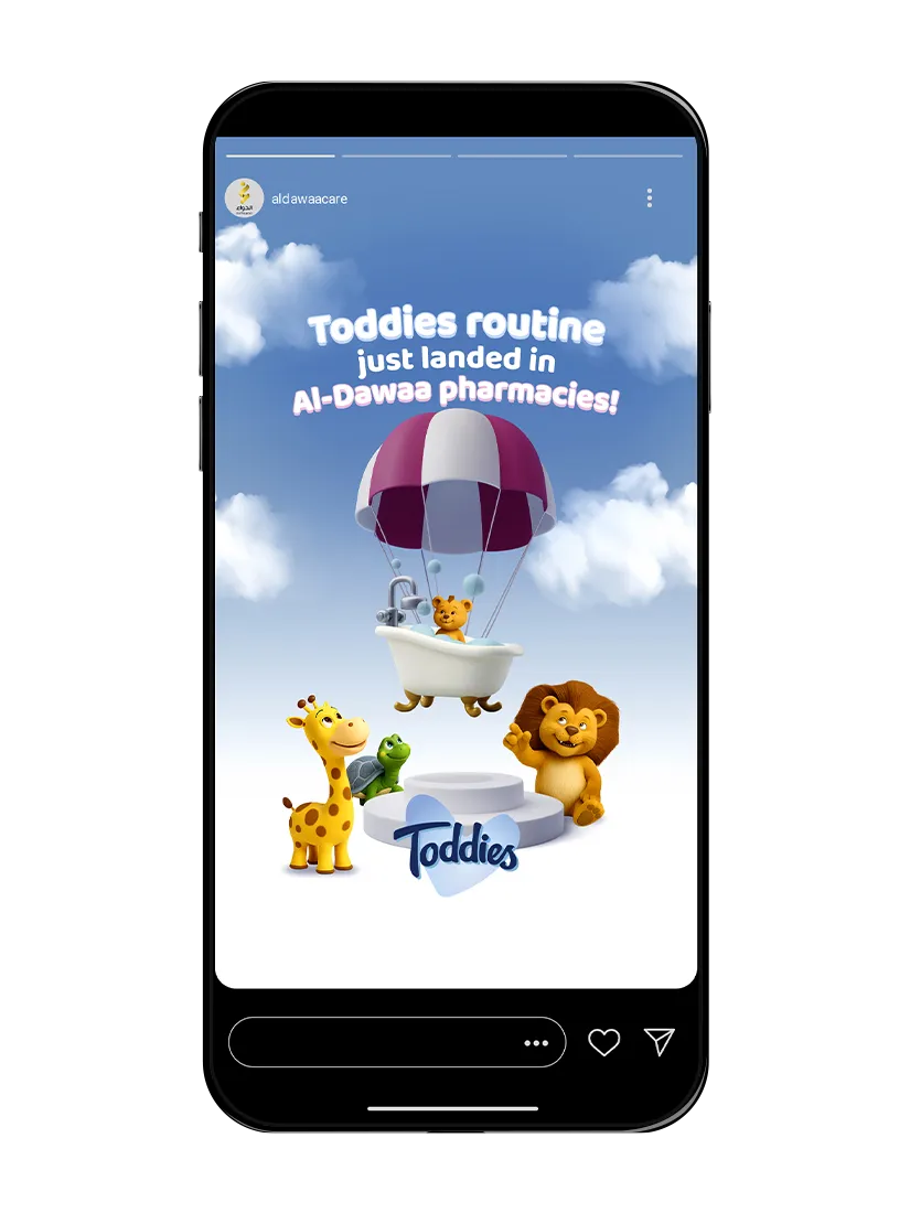
The result was a cohesive extension of the Toddies brand that introduced a softer side of its identity without losing recognition.