
Wellness Theory — trusting the process.
- Client
- Supercare
- Brand
- Wellness Theory
- Sector
- Health, wellness, supplements, pharmacy retail
- Markets
- UAE · Middle East
- Scope
- Brand identity refinement · Packaging design system · Range architecture · Category differentiation
- Formats
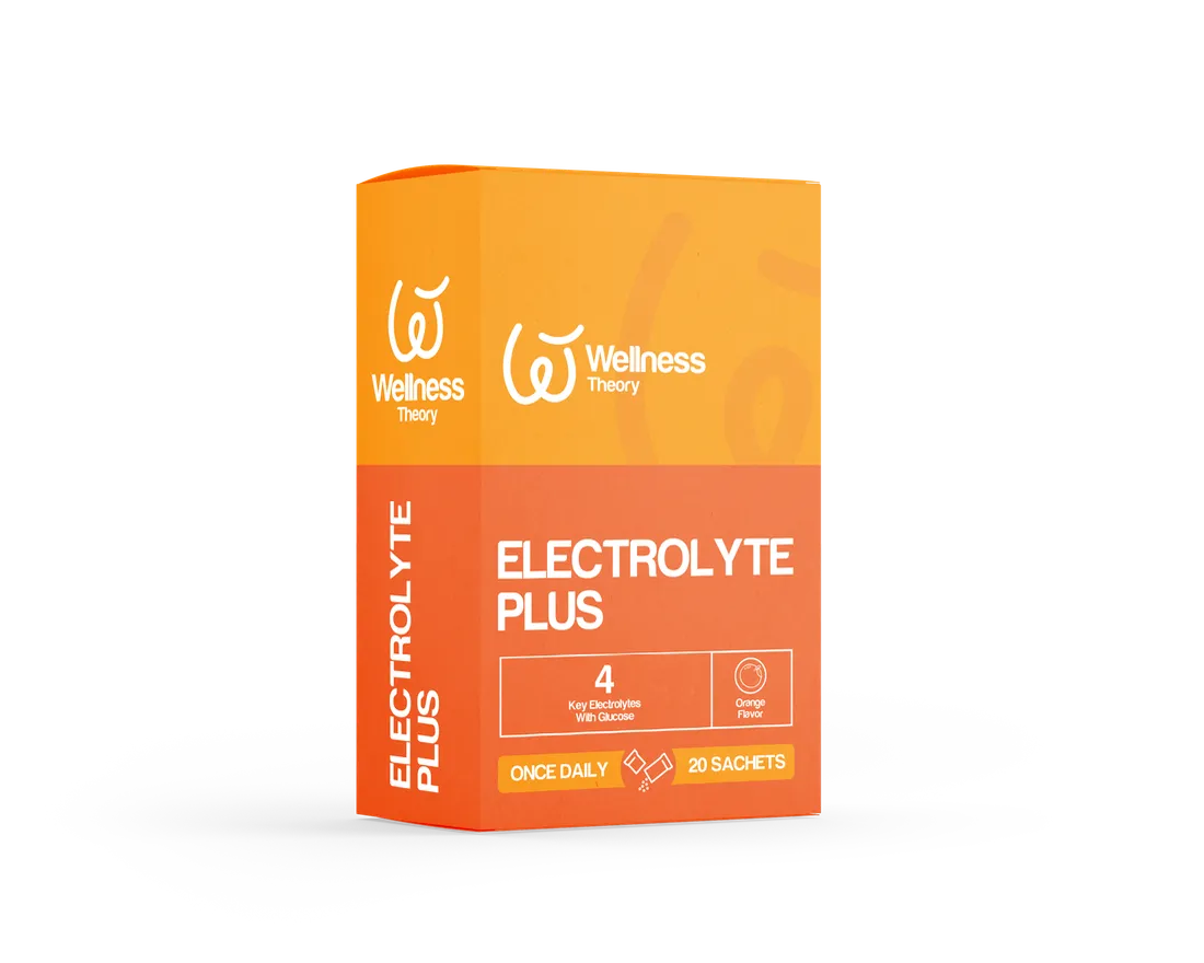
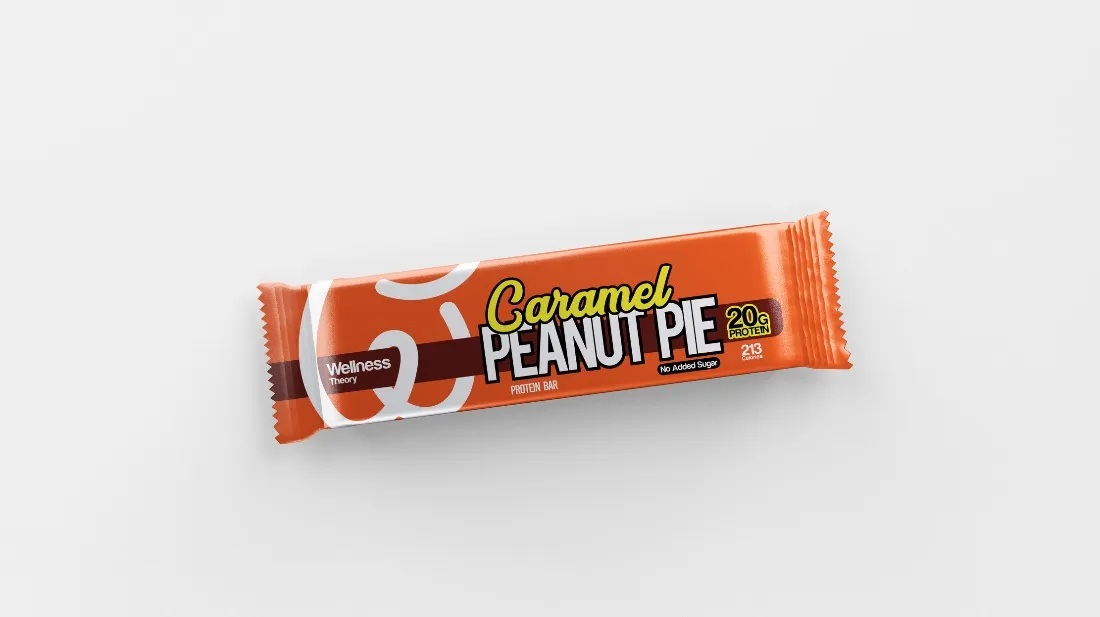
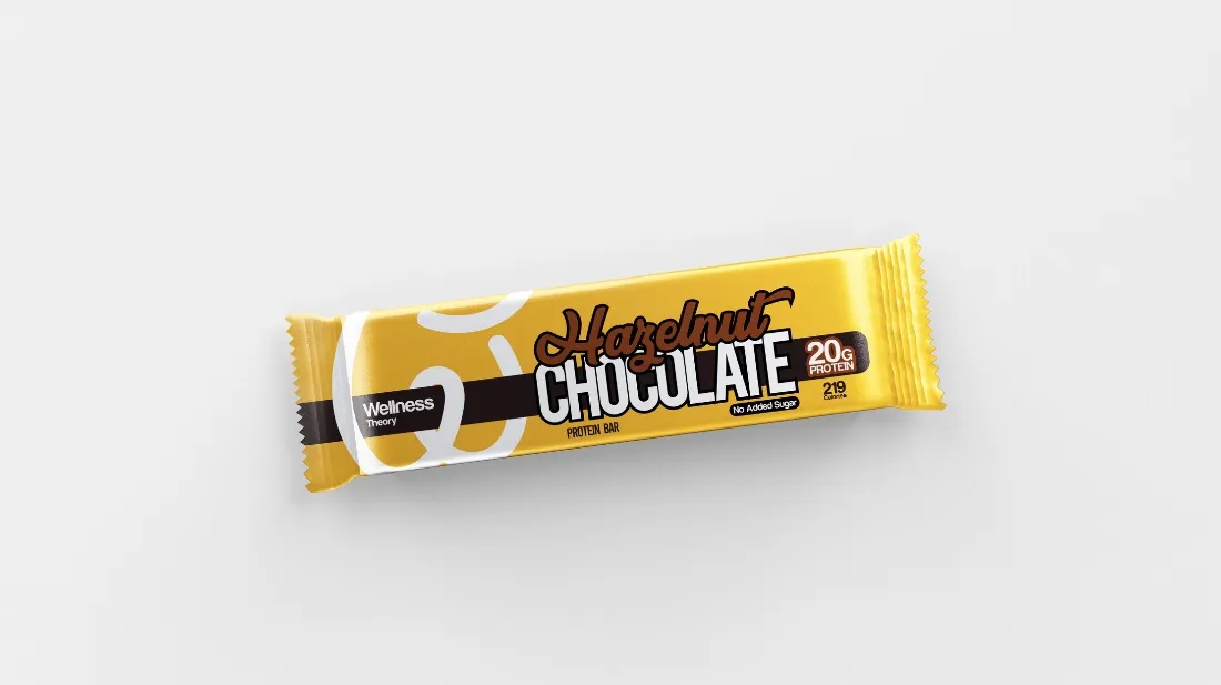
- Bottles · Effervescent tubes · Sachet boxes · Blister packs · Protein bars
One brand, many categories.
Built around flow.
A system that scales — four design principles that hold the range together across every format and category.
Flow as the core idea
Health, sport and wellbeing all point to one answer — flow. Continuous, determined movement, encoded in the logo and the soft graphic curves that carry the system across categories.
Modular packaging architecture
A single system that flexes across tubes, bottles, boxes, sachets, blisters and protein bars — keeping the range consistent while letting each format do its job.
Structured colour-coding
A clear, well-disciplined colour palette differentiates categories and dosage forms without breaking the parent identity. Premium look comes from restraint, not decoration.
Functional hierarchy
Strong typography, clean information hierarchy and a consistent icon set make benefits, ingredients and dosage easy to read at point-of-purchase — clarity, not decoration.
32+ products across six categories.
Six product worlds, one system. Each category has its own role on shelf — and its own colour key — while sharing the same architecture, typography and brand language.
Effervescent Tablets
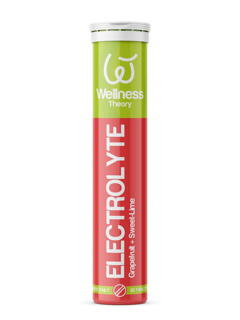
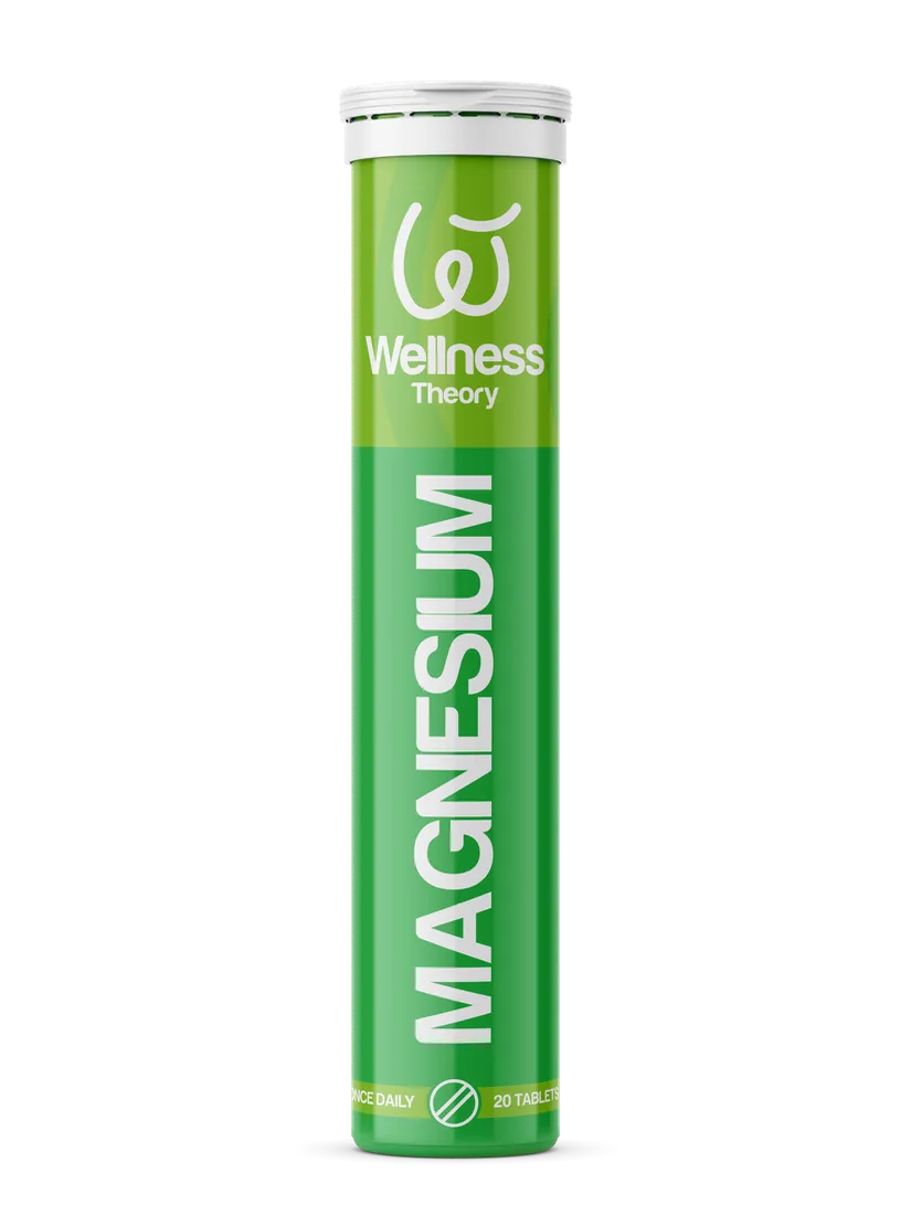
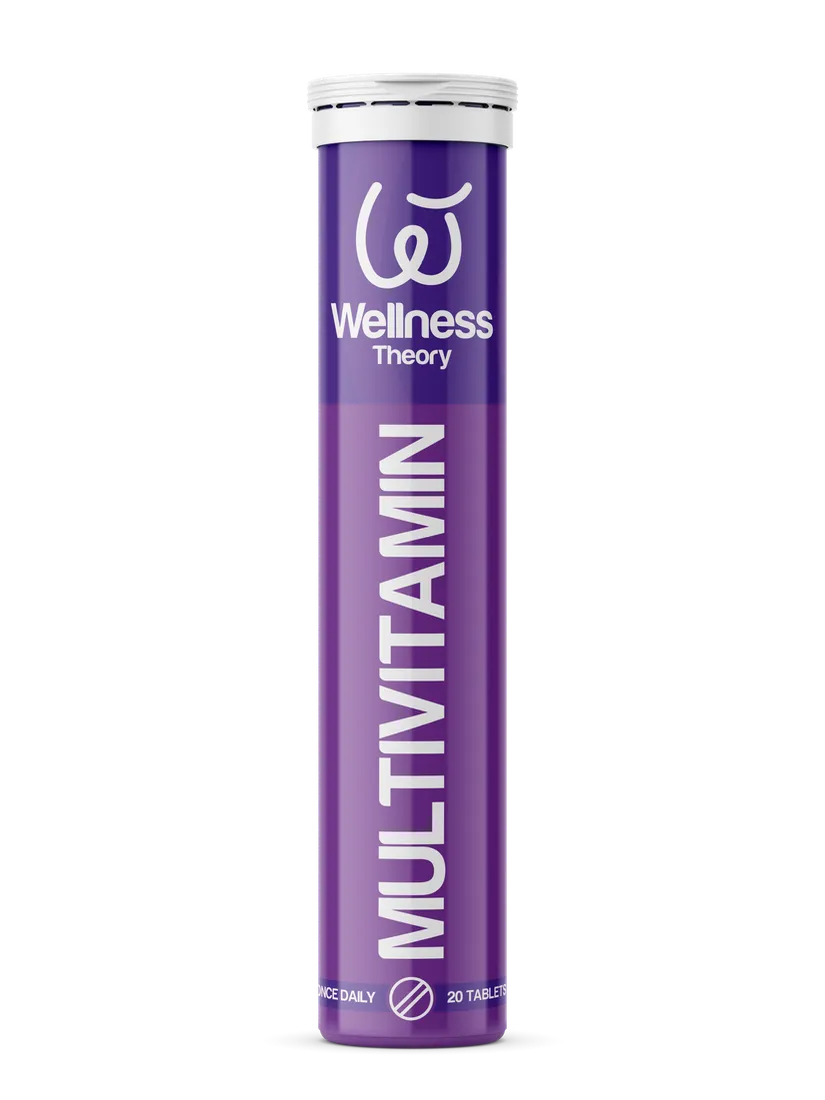
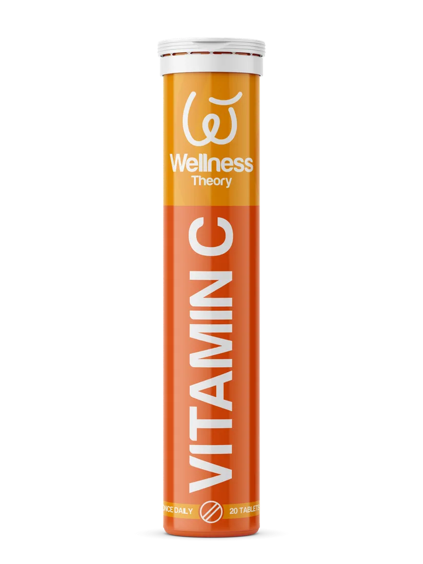
Electrolytes
Probiotics



Protein Bars

Vitamins & Supplements